Ochre by FER/Long Island City/2026
Scope
Brand Development
Interior & Spatial Design
Marketing & Creative
Operations
Concept
Ochre was conceived as a warmer and more grounded evolution of Fer. Located along the waterfront, the restaurant draws inspiration from earth tones, terraces, and cultivated landscapes, creating a space that feels calm, tactile, and deeply connected to nature. Rather than a quick service concept, Ochre is designed as a full dining environment where guests slow down, gather, and share meals together. It functions as a neighborhood dining room, welcoming families and friends to stay, talk, and linger.
Interior & Spatial Design
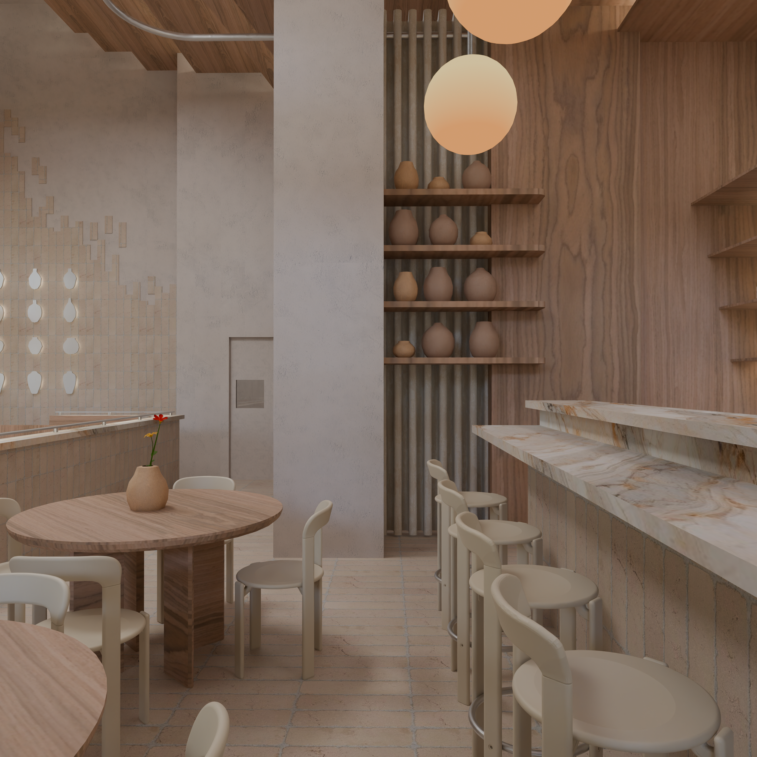
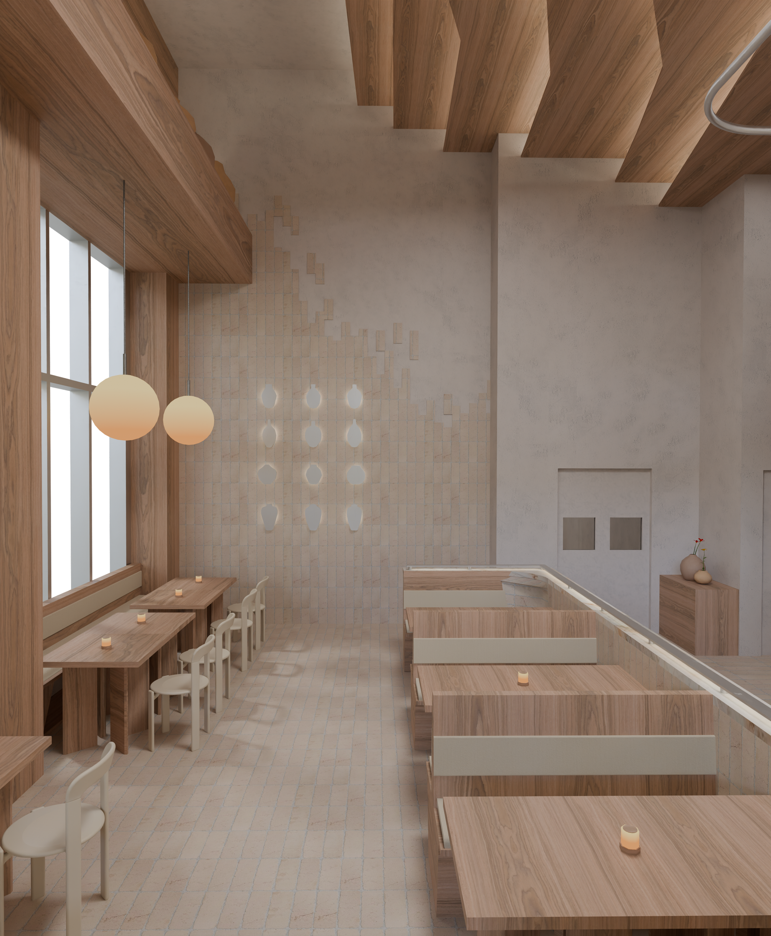
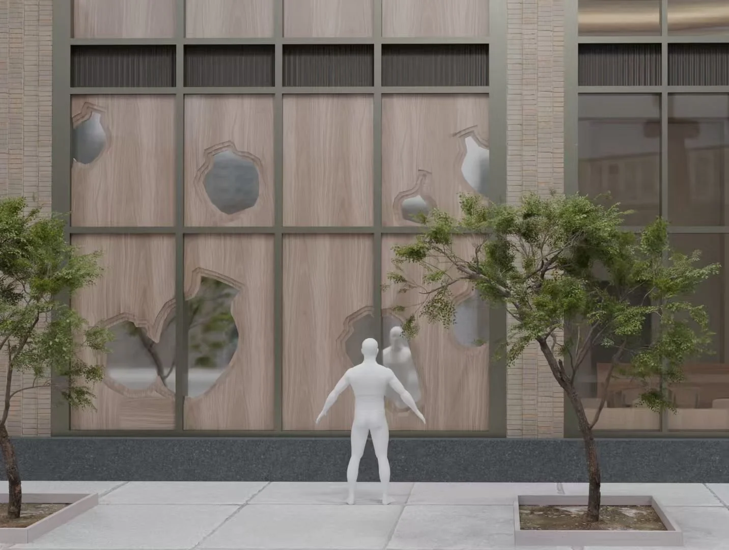
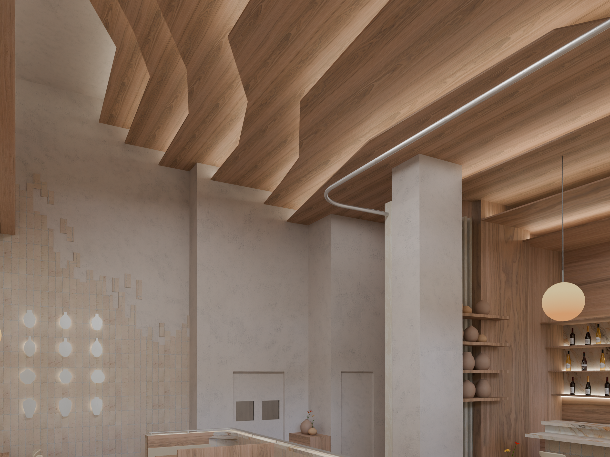
The interior is organized through a layered, terrace like composition that echoes stepped fields and natural topography. Warm wood, soft plaster, stone surfaces, and handcrafted clay vessels introduce a rich yet restrained material language that feels organic and timeless. Custom ceiling forms add depth and rhythm overhead, while built in seating and varied table layouts create a sequence of intimate zones throughout the space. Every element is designed to feel human scaled and welcoming rather than commercial or fast paced.
Branding
Ochre extends the Fer identity into a softer and more mature direction. The palette centers on earthy neutrals and clay inspired tones, with understated typography and minimal graphics that allow the architecture and materials to lead. From menus and tableware to signage and visual details, each touchpoint reinforces a sense of warmth, craft, and quiet sophistication. The brand language supports a slower, more elevated dining experience.
Marketing & Community
Positioned as a family friendly neighborhood restaurant, Ochre focuses on seasonal dishes, shared plates, and everyday gatherings. Programming, menu structure, and spatial layout all encourage longer stays and repeat visits. Over time, the space naturally becomes part of the local routine, serving as a comfortable meeting point for the surrounding residential community.
Outcome
Ochre establishes a new expression of Fer that feels elevated yet approachable. Through thoughtful spatial design, cohesive branding, and a strong material identity, the project transforms a simple restaurant into a warm and memorable destination. It demonstrates how design can shape behavior, creating not just a place to eat, but a place to connect.